
Description
Project Overview

The Good Ju Ju Shop is a sexual wellness brand offering crystal wands, yoni eggs, and sacred pleasure tools designed to support womb health, sensual healing, and spiritual connection. The goal of this project was to develop a brand identity that merged sexuality and spirituality — positioning pleasure as both empowering and sacred.
This included designing a full visual identity system: logo suite, brand marks, typography, color palette, and foundational brand assets. The creative direction was guided by soft curves, symbolic geometry, and feminine tones that reflect both intimacy and reverence.
The Results
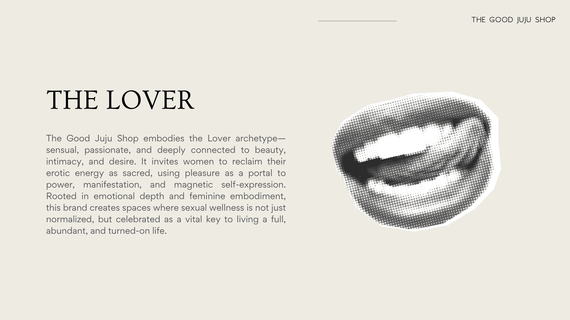
BRAND ARCHETYPE
The Good Ju Ju Shop is anchored in the Lover archetype — representing sensuality, intimacy, beauty, and connection. This archetype informed the tone and design direction of the brand: soft, seductive, and emotionally resonant. Every element was crafted to invite the customer into a deeper relationship with self — through pleasure, ritual, and self-love.
PRIMARY LOGO
The primary logo integrates sacred symbolism and organic curves to reflect the brand’s core values of embodiment and healing. The shape is intentionally reminiscent of both a vulva and a heart, representing the merging of sensuality and love. The lines are fluid and feminine, designed to feel intimate, intuitive, and deeply intentional.

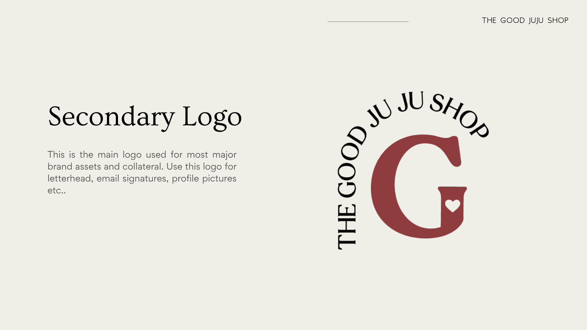
SECONDARY LOGO
The secondary mark is a simplified variation of the main logo — flexible for use across smaller brand applications like packaging, stamps, and social media avatars. It retains the core essence of the brand’s visual language, allowing consistency without visual clutter. It functions as a sacred seal: subtle, symbolic, and unmistakably “Good Ju Ju.”
BRAND COLOURS
The colour palette for The Good Ju Ju Shop was designed to be evocative, grounded, and emotionally resonant. Each shade was chosen for its symbolic connection to the body, spirit, and sensual self:
EROS (deep berry): Passion, erotic vitality, and feminine fire
VERDE (earthy green): Growth, womb wisdom, grounding energy
CRÈME DE LA CRÈME (soft neutral): Softness, safety, and sacred simplicity
THE VOID (charcoal black): Depth, mystery, the unseen inner world
Together, the palette balances softness and seduction, creating a feeling of both intimacy and empowerment. These colours hold emotional weight while remaining versatile across digital and physical touch points, allowing the brand to feel luxurious, embodied, and unmistakably feminine.

CONCLUSION
The Good Ju Ju Shop brand identity brings sacred sensuality to life through intentional design rooted in symbolism, archetypal storytelling, and intuitive creative direction. The result is a visual language that feels bold yet soft, elevated yet intimate — holding space for both pleasure and power. This project reflects the potential of branding to go beyond aesthetics and become a vessel for transformation, connection, and embodied expression.
Client Feedback
“I honestly didn’t expect to feel this seen through a brand. Drew took everything I was trying to articulate and turned it into something that feels so aligned visually, energetically, emotionally. The logo, the colors, the vibe it all speaks to exactly who we are and the kind of space we’re creating. It’s sensual, sacred, and so intentional.."